The Wayfinding Handbook
For the Rebuild Project - 2019
Click here to view 'The Re-Build Project' in Interiors
Background
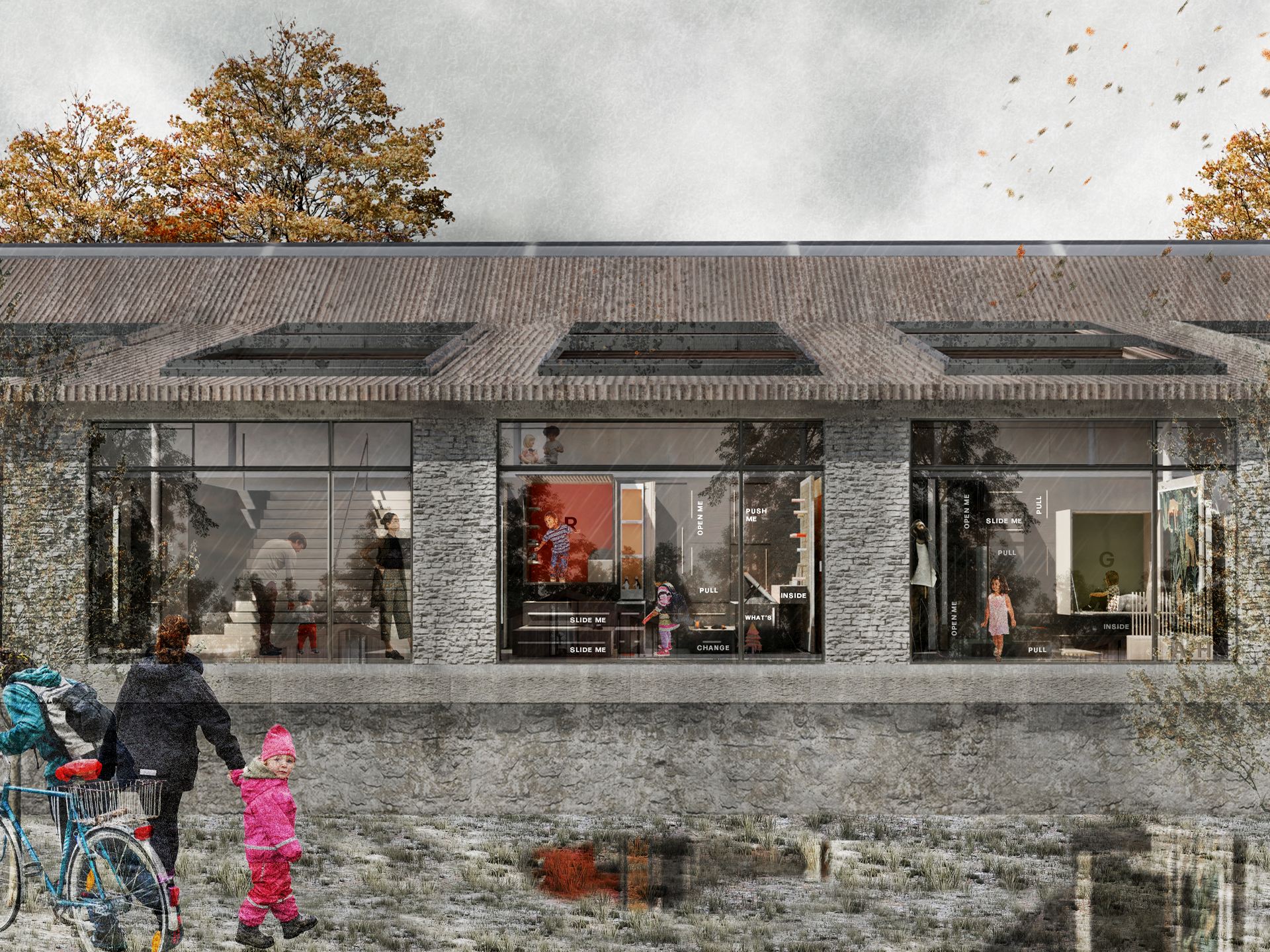
Built on accumulated research into the refugee community in Bristol and non-verbal communication, the Handbook showcases how to navigate The Re-Build Project.
As the interior scheme focuses on communicating without the reliance of language it is imperative that the users can navigate the space successfully and with a certain level of ease. To do this graphics are essential, and the handbook would be given to individuals upon arrival to keep or return when they no longer need it and can be passed on to the next person who does.
Graphic Design
Icons
The icons are used to indicate what areas are and what activity happens in them. These act as visual communication which occurs through pictures. In the book, the 2 column layout is simple - the icon paired with the English term for the space. This aids in the learning of English if the individuals want to.
Futura PT book font is used for its clear and easy to read ability.
Wayfinding
Lines on floors indicate movement trails around the interior whilst arrows indicate the direction of different spaces. The activity circles are for stopping and larger communal areas. Following the same layout as the icon spread, the simple two column layout showcases the visual icon individuals will see and their term. Additional elements such as destination spot and footprints have been added to the page to indicate its topic.
Numbers
A widely common language, numbers are used to locate specific areas within the space. On the page they have been organised to demonstrate the relevant location through pictured icon. The maximum amount of icons to show the space are 3 and are stamped onto the grid below the number adding human touch to the pages.


